Testino Tribute
Black & white treatments make a huge impact.
I’ve worked with a couple other people now for my towel series Testino tribute mini-project. So far it’s been a fun, quick, diversion that’s worked generally well on a diverse set of people. I’ll probably continue down the road and make a few photographs here and there while I’m working on other things. Why not?
The more I photograph women, the less it is about transformation. Women are beautiful. All that really matters is enhancing that.Mario Testino
I wanted to post a very short piece to convey a few thoughts that crossed my mind while looking through a few frames I’ve recently made for this mini-project having to do with black and white photography. Which particular frames I liked were easily determined given how few I made during each session. The much more difficult propostion has been in deciding on the particular black and white treatment to go with. I’ll probably take a que from Mario and not worry too much about absolute consistentcy in lighting, treatment, or venue but even within one session choosing a black and white rendering has been a challenge.

I’m a traditionalist in many ways. My starting points for black and white are carefully modeled after actual films, the way I processed and printed those films when I was primarily using film over the course of a few decades. The color response (although similar) is as close as I can get it and the contrast, more specifically where that contrast manifests itself, is also as close as I can get it to my typical development and print when using a particular film. In many ways all black and white films were similar and could be made to look similar (except for grain) my modifying development and printing. Even then there were differing subtleties between them enough to notice for a black and white zealot.
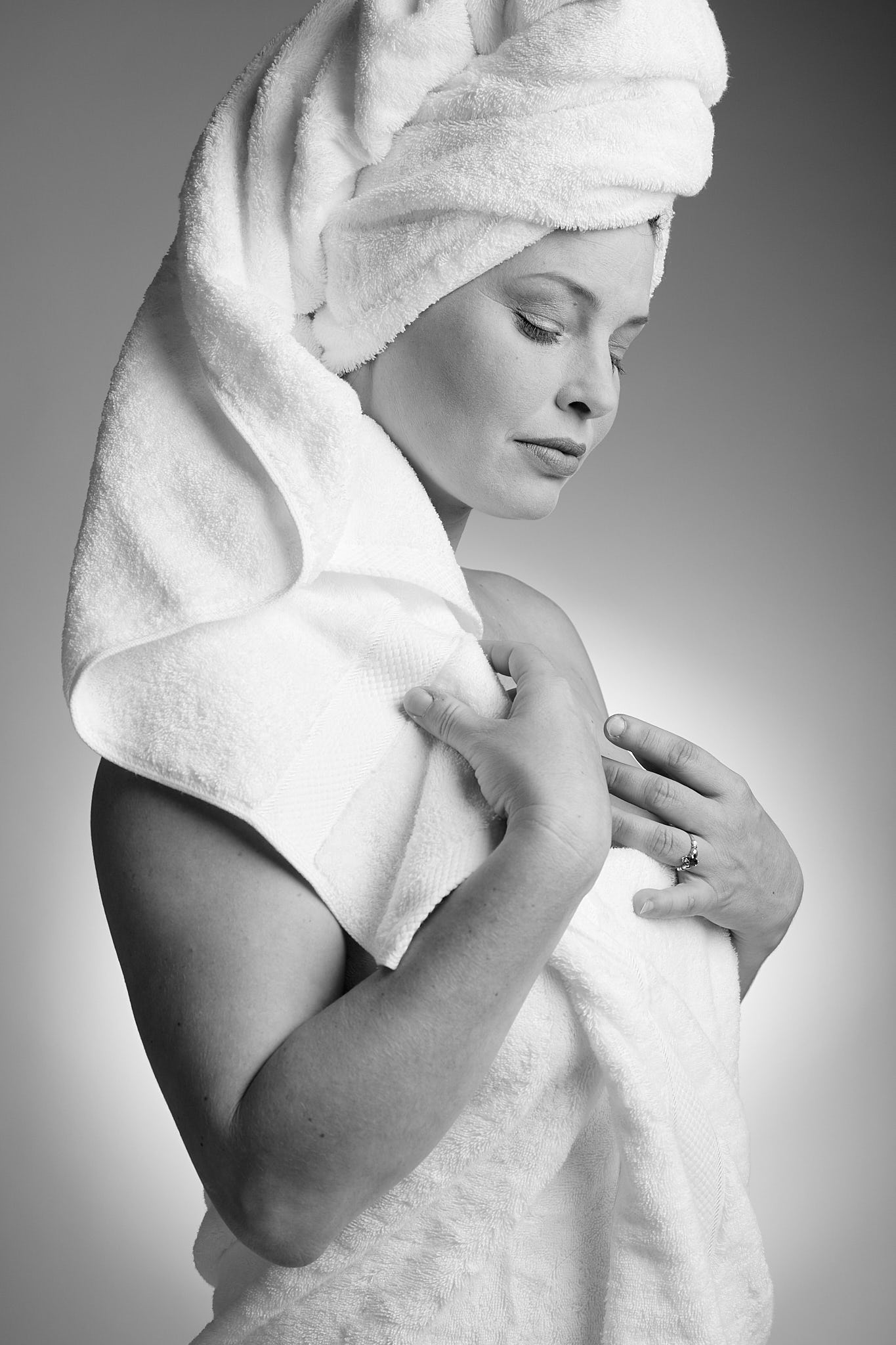
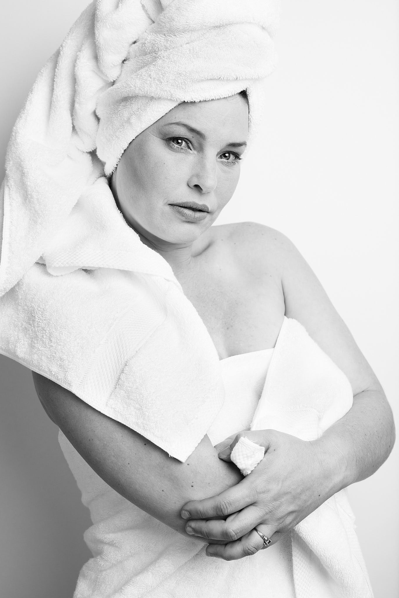
Take the above photos. The first one was obviously made with a different lighting setup than the second one. The first is somewhere around a 3:1 lighting ratio with a lot more lighting contrast than the second which was more in line with a 2:1 ratio. At fist glance one might say the first one has more contrast. It does but taking a closer look at the treatment and it’s associated contrast you can see that the within similar toned areas there’s far more contrast in the second image. The first image treatment is a close approximation for Ilford XP2 Super, a unique black and white film that inherently had a very linear response and very low contrast. In english it is capable a very subtle rendering and was a wonderful film for portrait/people. The second photo’s treatment is very close to Ilford PanF+. That film was had immense amounts of contrast that was sometimes hard to tame and a subtle rolloff in the extreme highlights.

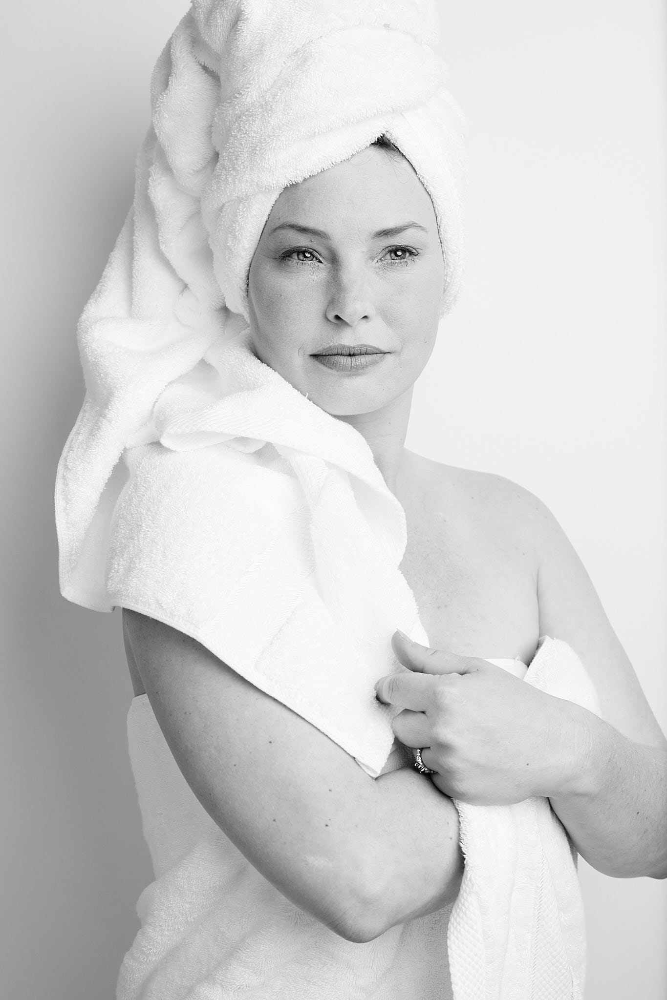
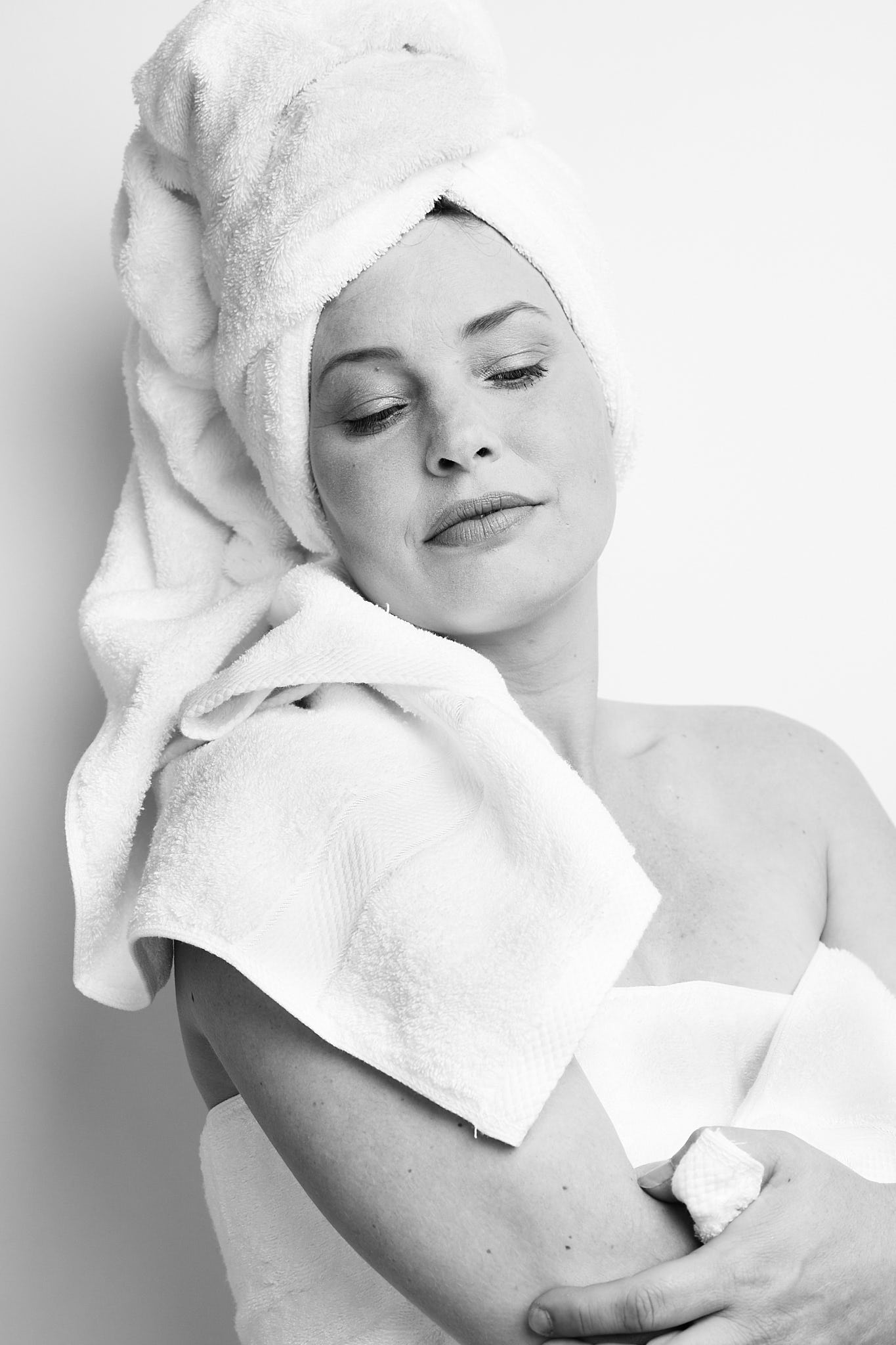
Above is the same lighting setup but instead with the Ilford XP2 Super treatment of far lower contrast as a more head to head comparison. They both have their merits. One could go either way with the treatment. Below is another using the higher contrast Ilford PanF+ rendtion. That’s the blessing and the curse of digital in a nutshell. On one hand you have infinite choice after the fact. On the other hand sometimes it’s far more simple to have some choices baked in when you shot it. Sure after the film was processed you could fiddle around with print contrast, dodging and burning, etc but the variety was far more limited. I think I’ll take the simple road and flip a coin to decide.
